CSS Navigation Tutorial
Creating a Horizontal CSS Navigation Menu
Written by: Dmitry Fadeev
The latest navigation menu design trend these days seems to be in horizontal navigation sitting under or by the side of the site branding, rather than the traditional vertical column navigation by the side of the content. Our Pixelshell site uses both, vertical and horizontal, horizontal being the main navigation, and the vertical placed in the sidebar when required.
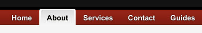
Pixelshell horizontal navigation as seen using the Safari browser
Horizontal navigation has its advantages — it is linked to a real life metaphor of tabs in folders. A lot of software interfaces utilize this metaphor by creating visual tabs at the top of the window which the user can use to navigate the content. Tabs work especialy well when there are visual indicators, such as the currently selecting tab clearly being connected to the content, so the user can instantly see which section they're currently in. We use a semi-tab navigation, where there is a visual 'tab' showing the selected section, and a list of links by the side without the tab wrapper. This is our design choice, and you can of course implement a more 'tab-like' interface, but in this tutorial I shall walk you through the steps I took when creating the Pixelshell horizontal menu. For this tutorial you will need at least a very basic knowledge of how to code XHTML pages, though nothing advanced.
Overview
So where do we start with this? Firstly, we'll have to think about how we will structure our XHTML code. The navigation is in essence a list of links. There is nothing special about a list is there? Indeed there isn't, however, XHTML features markup designed specifically for lists. This feature is the <ul> </ul> (unoredered list) and <ol> </ol> (ordered list) tags. Ordered lists are used for items with numbers or a sequence and unordered list for everything else. Our list of links doesn't really follow any particular order, so an unordered list will work well here. The code for a list of navigation links will then look as follows:
<li><a href="http://..">Link1</a></li>
<li><a href="http://..">Link2</a></li>
<li><a href="http://..">Link3</a></li>
</ul>
Obviously you'll have to replace the "href=" to point to the address of your chosen page, and change the "Link" text to what you want the link to say on the navigation bar. This code will create the very basic navigation list, however, if you put it in your page and load it up, you will of course notice that this creates a vertical bulleted list of links, rather than a horizontal navigation bar that we want. Fear not, the list can be easily styled with CSS to look like anything we want.
Semantic Markup
Before we do this however, we're going to add a little more meaning to the markup, and at the same time create a useful 'hook' which we can use to more directly target our navigation menu with CSS styling. We're going to wrap our navigation list with a <div> tag (identifier for a separate division of content). We'll give this division an "id" property to give it a name "navigation" for easier identification and CSS styling. Perhaps you've noticed that we can actually add an "id" to the unordered list (<ul>) tags, getting rid of the need for the extra division (<div>). This can work, however, if you wish to have the navigation centered on the page, you will be best off adding the extra division, and then centering the unordered list within it. This will also allow you to add a background image to the division later, creating a 100% wide horizontal bar. Here's what our new code will look like:
<ul>
<li><a href="http://..">Link1</a></li>
<li><a href="http://..">Link2</a></li>
<li><a href="http://..">Link3</a></li>
</ul>
</div>
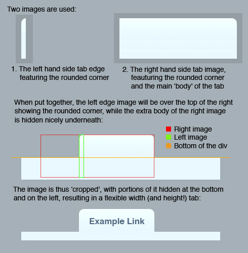
There is still some more things we can do with our markup before we proceed to CSS, in order to make it even more meaningful, and to give us even more 'hooks' which can be used to style the navigation. For us to add resizable tab images to the links, we'll need at least two items to style. Why two? If we had a fixed width tab image, we could add this image as a background to each link, however, the tabs will have to be fixed width because of the static image. We want to have flexible width tabs, which are sized automatically depending on the length of the link text. We can do this by using two images instead of one, a left hand side tab image that is used for the round corner on the left, and a right hand side image that has the 'body' of the tab including the round corner on the right. This is a technique called "Sliding Doors", developed by Douglas Bowman, and outlined in his "A List Apart" article. This sounds a little confusing, so let me illustrate this idea:
So in order to 'attach' these images to the actual links, as their backrounds, we need two identifiers. By default, there actually are two different identifiers already in place: the list (<li>) and anchor (<a>) tags. We can target these two tags with CSS to add the left and right tab image backgrounds to our links, but let's not stop here, because we can do something more clever. The Pixelshell site shows the current section with an 'active' tab image. This 'active' tab is selected automatically by using a little extra markup. What I did was I added an "id" to each <li> and <a> tags. I've also added an "id" to the page <body> tag, to identify the actual web page. Again, this sounds a little confusing at first, but stick with me. Here's what our code looks like now:
..
<div id="navigation">
<ul>
<li id="ll1"><a href="http://.." id="al1">Link1</a></li>
<li id="ll2"><a href="http://.." id="al2">Link2</a></li>
<li id="ll3"><a href="http://.." id="al3">Link3</a></li>
</ul>
</div>
Do make sure to use meaningful names for the list items and the link anchors, I'm just lazy so I'm using "ll1" for the list item and "al1" for the anchor item. Also notice I've added the body id called "page1". That covers all of our navigation code. One last thing remains is to add a link to an extrnal CSS file if you haven't already, so we can effectively style our new navigation. Add the following line of code somewhere between the <head> and </head> tags of your page code:
You are probably familiar with how CSS works, but if you're not let me explain very quickly. What that line of code does is include the code in the stylesheet called "style.css" into our new page, allowing it to be styled from this extrnal CSS file. You can name your file anything you want, I'm just using "style.css" that is located in the main home directory where the XHTML files will be located. You can even use multiple stylesheets, but that's a discussion for another day. Phew! That's all the markup we'll need in our XHTML file! Time to do some styling.
Create the Images
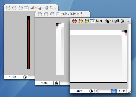
Use an image editing program like Adobe Photoshop to create the required navigation images. I've used three images for the Pixelshell navigation as outlined above. Two images for the 'active' tab, and an image for the navigation <div> background. My division image is only 1 pixel wide — this is because it's going to be repeated horizontally over and over, and because I only have a simple gradient it will only need to be 1 pixel wide to generate the desired effect. Here's the three images I've created in Adobe Photoshop at 500% zoom (note that the right tab image is actually 300 pixels wide to allow the tab to stretch with different amount of text):
The CSS
After saving our images as a GIF or PNG (or JPEG, but the quality will not be very crisp) file, we can start writing the necessary CSS to style our navigation. Create/edit the stylesheet file (style.css) and add the following lines of code (I will paste the whole of the CSS code required and will go through it below):
position: relative;
background: url(images/tabs.gif) repeat-x #8e0f00;
height: 2.4em;
border-bottom: solid 3px #6f0900;
}
#navigation ul {
float: left;
position: relative;
left: 50%;
margin: 0 0 0 -390px;
list-style: none;
}
#navigation ul li {
float: left;
padding-left: 5px;
}
#navigation li a {
float: left;
display: block;
text-decoration: none;
padding: 0.6em 1em 0.3em 0.7em;
font-family: Arial, sans-serif;
font-size: 15px;
color:#fff;
font-weight: bold;
}
#navigation ul li a:hover {
color:#ff9900;
}
body#page1 #ll1,
body#page2 #ll2,
body#page3 #ll3 {
background: url(images/tab-left.gif) top left no-repeat #f5f5f5;
}
body#page1 #al1,
body#page2 #al2,
body#page3 #al3 {
background: url(images/tab-right.gif) top right no-repeat #f5f5f5;
color: #000;
border-bottom: solid 3px #f5f5f5;
}
That's a lot of new code to digest. If you paste it in and run the site it should hopefully work, but let me just go through each of the selectors with you so that its meaning becomes much clearer. Let's examine the first block:
position: relative;
background: url(images/tabs.gif) repeat-x #8e0f00;
height: 2.4em;
border-bottom: solid 3px #6f0900;
}
This block of CSS deals with styling the "navigation" division. We're specifying a 'relative' position to allow us to position the unordered list within this division. Then we set the background image with a shorthand CSS property called "background", and we also speficy a background color to go 'under' the image, incase the navigation bar becomes higher than the height of our background image (if somebody makes the text much larger in their browser for example). We also set the height of the div (with the relative 'em' value) and create a little shade effect using the "border-bottom" property. The reason for not adding this border on the image graphic itself is to allow it to remain fixed to the bottom of the navigation bar if people resize the text. Let's examine the next selector:
float: left;
position: relative;
left: 50%;
margin: 0 0 0 -390px;
list-style: none;
}
This next block deals with the unordered list as a whole. We're floating it left to allow us to use the "negative-margin" positioning technique. As you can see, we tell the browser to then position it 50% from the left, and then create a -390 pixel margin on the left, which offsets the navigation list so that it sits nicely aligned to the left edge of our centered site design, and moves together with the rest of the page when the browser is resized. Finally, to get rid of the bullet points on our list items, we use "list-style: none".
float: left;
padding-left: 5px;
}
This selector styles each of the list items themselves. To convert the vertical list into a horizontal bar, we're floating each list item to the left, so they stack horizontally side by side. The padding on the left is to show the left tab image and so should be the same width as your image.
float: left;
display: block;
text-decoration: none;
padding: 0.6em 1em 0.3em 0.7em;
font-family: Arial, sans-serif;
font-size: 15px;
color:#fff;
font-weight: bold;
}
Here we style the link anchors. Link anchors are 'inline' elements, meaning they take the dimensions of the text within them, rather than acting as a block similar to a div. We want our links to act as a block in order to style them better. We do this by using the "display: block" property, and again, float each to the left. We remove any text-decoration a browser may apply to it and add padding around the edges to center the link text nicely. You may have to fiddle with these values for your navigation as they depend on the tab images and the text size. Lastly we select the fonts we want and style them.
color:#ff9900;
}
This selector simply styles the links when you hover your mouse over them. I wanted some sort of visual feedback, so I'm changing the font color here. And this is it for our navigation bar itself. The last two blocks of CSS code are responsible for dynamically showing the active tab on the page you're at, without needing any extra markup in the actual XHTML. Let's examine them:
body#page2 #ll2,
body#page3 #ll3 {
background: url(images/tab-left.gif) top left no-repeat #f5f5f5;
}
body#page1 #al1,
body#page2 #al2,
body#page3 #al3 {
background: url(images/tab-right.gif) top right no-repeat #f5f5f5;
color: #000;
border-bottom: solid 3px #f5f5f5;
}
Remember when we gave our <body> tag an id of "page1"? Here's where it comes handy. Our CSS says that on a page with a body id of "page1", list items labelled as "ll1" will show up the left tab image as their background, and link anchors with an id of "al1" will show the right tab image as their background, as well as styling the links with a color and a bottom border image. The same principle works for "page2", "page3" and whatever other page you may like to add: just remember to give the body an id, and add this information to the CSS file. Simple.
Notice that I'm using a bottom border here that's the same color as the tab image itself and my page color. Why am I doing this? This border will sit dirctly over the top of the "navigation" div border, cancelling out the darker shade at the bottom of the navigation bar and visually connecting it to the rest of the page. This allows our tab to 'flow' into the page, indicating relation.
And that's finally it! Hopefully you now arrive at a horizontal navigation menu similar to the one at Pixelshell by following this guide. The main thing to take away here of course is the technique, not the result. By using the bottom border you can achieve a scalable shadow that sticks to the bottom of our navigation bar and is overlapped by the active tab. By using two tab images, you can create variable width and variable height tabs, that can even scale when the user resizes their text. There are many great tutorials available around the web that explain how to create different varieties and flavours of the horizontal menu, and if you're planning on building one yourself I suggest you look around first and find a set of techniques that will best suit your website. I hope you've enjoyed this guide. Feel free to contact me if you have any queries regarding it.